9. Clustering for energy systems modelling 📥#
![]()
This chapter is partly inspired by [KFC22] and [HRS+17].
Goals of this exercise 🌟#
We will learn about different types of clustering
We will apply clustering algorithms to small examples
We will use clustering to determine representative days for input data for an energy systems model
A quick reminder ✅#
What is clustering?#
Clustering is an unsupervised learning technique. This means there is no output or target variable, we only have the input data. Instead of prediction, we are trying to make sense of the data, detect unknown groups, and reveal hidden structures.
There are three categories of clustering techniques:
Centroid-based algorithms: Clusters are determined by their distance to the centroids of the clusters. E.g., k-means clustering
Density-based algorithms: The density of the points in the multivariate input space is the basis for the clustering. E.g., DBSCAN
Probabilistic (distribution-based) clustering: The algorithm uses the probability of belonging to the same cluster by assuming an underlying distribution. E.g., Gaussian mixture model
Why clustering?#
The a chemical engineering context, many process characteristics can cause groups to appear in the data. They include multiple operating modes (start-up, normal operation, shut-down), varying demand, production levels, or feedstock compositions. Incorporating specific cluster knowledge into the models is beneficial; sometimes one can build cluster-wise models for more accurate performance.
A second reason is computational burden. Training machine learning models – or any other models – can be slow when using large data sets. Clustering can be used to reduce the data set to a few clusters. This reduces the computational time needed for the models.
K-means clustering#
For k-means clustering, the user specifies the number of clusters k. Then k points are randomly selected as centroids. Next, the distance of all the data points to the centroids is calculated, and they are assigned to the centroid which is closest to them. Then the mean of each cluster is calculated and defined as the new centroid. This is repeated until a stopping criteria is met.
This is equivalent to the following optimization:
with number of clusters \(K\), centroids \(c_k\), and data points \(X_k\) in cluster \(k\).
DBSCAN#
Density-based spatial clustering for applications with noise, DBSCAN, is a density-based clustering algorithm, meaning it groups points together if there are a lot of them in a certain area. The user specifies a minimum number of neighbors \(N\) and a distance \(\epsilon\). Then, if there are more than \(N\) points within \(\epsilon\) of a point, this point is labelled core point. If there are less than \(N\) points within \(\epsilon\) of a point, but it is within \(\epsilon\) of a core point, it is labelled border point. Otherwise, the point is classified as noise. The algorithm can deal with arbitrarily shaped data, and the number of clusters is determined as part of the procedure. However, \(N\) and \(\epsilon\) are hyperparameters which have to be carefully selected.
Gaussian mixture model#
A Gaussian mixture model assumes that the overall probability density is a combination of local Gaussian densities. Every cluster has a mean (analogous to the centroid in k-means), and a covariance. For every point, these can be used to calculate the probability of belonging to this cluster. When a GMM is fitted, the expectation maximation (EM) algorithm is carried out. First, the membership association of the data points to the clusters is calculated as posterior probability using the mean and convariance. Then, using the points in every cluster, the mean and covariance are updated to reflect the distributions. This is repeated until convergence. It is advantageous that the result is not just the assigment to a cluster but the probabilities of belonging to each cluster for all the data points. This is referred to as soft-clustering.
Comparing clustering algorithms#
Let’s try the different clustering techniques on some simple examples.
import warnings
warnings.filterwarnings('ignore')
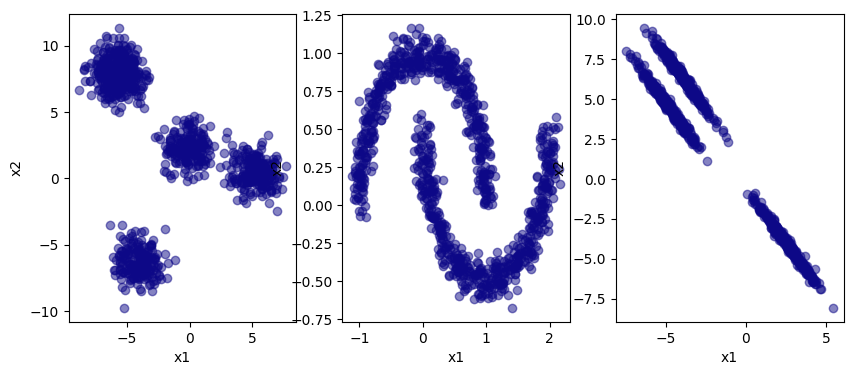
First, we generate a data set.
from sklearn.datasets import make_blobs, make_moons
import numpy as np
import matplotlib.pyplot as plt

X, y = make_blobs(n_samples=1000, centers=5, random_state=5)
x1 = X[:,0]
x2 = X[:,1]

W, v = make_moons(n_samples=1000, noise=0.07)
w1 = W[:,0]
w2 = W[:,1]

P, q = make_blobs(n_samples=1000, centers=3, random_state=100)
transformation = [[0.80, -1.00], [-0.4, 0.7]]
P = np.dot(P, transformation)
p1 = P[:,0]
p2 = P[:,1]


clustering_colors = {  -1: plt.get_cmap("Greys")(0.7) , # ; # noise
                        0: plt.get_cmap("plasma")(0) ,
                        1: plt.get_cmap("plasma")(0.4) ,
                        2: plt.get_cmap("plasma")(0.8) ,
                        3: plt.get_cmap("plasma")(0.9) }

for i in range(4,30):
    clustering_colors[i] = plt.get_cmap("plasma")(np.random.rand(1))

def get_colors(cluster_list):
    color_list = []
    for i in cluster_list:
        color_list.append(clustering_colors[i])
    return color_list


f, (ax1, ax2, ax3) = plt.subplots(1,3)

ax1.scatter(x1, x2, color = get_colors([0]), alpha=0.5)
ax1.set_xlabel("x1")
ax1.set_ylabel("x2")

ax2.scatter(w1, w2, color = get_colors([0]), alpha=0.5)
ax2.set_xlabel("x1")
ax2.set_ylabel("x2")

ax3.scatter(p1, p2, color = get_colors([0]), alpha=0.5)
ax3.set_xlabel("x1")
ax3.set_ylabel("x2")

f.set_size_inches([10,4])
k-means#
Now let’s try k-means clustering on this data set.
from sklearn.cluster import KMeans

kmeans = KMeans(n_clusters=4, random_state=0, n_init=10).fit(X)
X_labels = kmeans.labels_
X_clusters = kmeans.cluster_centers_

kmeans = KMeans(n_clusters=2, random_state=0, n_init=10).fit(W)
W_labels = kmeans.labels_
W_clusters = kmeans.cluster_centers_

kmeans = KMeans(n_clusters=3, random_state=0, n_init=10).fit(P)
P_labels = kmeans.labels_
P_clusters = kmeans.cluster_centers_

f, (ax1, ax2, ax3) = plt.subplots(1,3)

ax1.scatter(x1, x2, c = get_colors(X_labels), alpha=0.5)
ax1.scatter(X_clusters[:,0], X_clusters[:,1], color="k", marker="^")
ax1.set_xlabel("x1")
ax1.set_ylabel("x2")

ax2.scatter(w1, w2, c = get_colors(W_labels), alpha=0.5)
ax2.scatter(W_clusters[:,0], W_clusters[:,1], color="k", marker="^")
ax2.set_xlabel("x1")
ax2.set_ylabel("x2")

ax3.scatter(p1, p2, c = get_colors(P_labels), alpha=0.5)
ax3.scatter(P_clusters[:,0], P_clusters[:,1], color="k", marker="^")
ax3.set_xlabel("x1")
ax3.set_ylabel("x2")

f.set_size_inches([10,4])
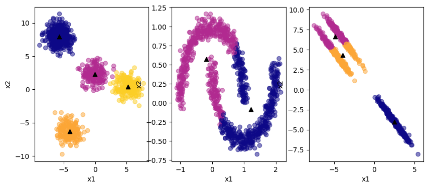
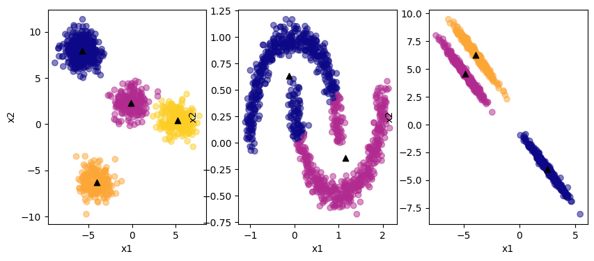
The black triangles are the centroids of the clusters. K-means clustering does fine with the first example. It cannot correctly identify the clusters in the non-linear data or the elliptical data. Further, it requries the specification of the number of clusters a priori! Edit the number of clusters in the code and see what happens.
How can we know the right number of clusters if the data is not easily visualized and high-dimensional? We can use the average distance of the cluster data points to their centroids, provided by the k-means instance as inertia:
num_k = [1, 2, 3, 4, 5, 6, 7]
errors = []

for k in num_k:
    kmeans = KMeans(n_clusters=k, random_state=0, n_init=10).fit(X)
    errors.append(kmeans.inertia_)
f, (ax) = plt.subplots(1,1)
ax.plot(num_k, errors, lw=0.2, marker= "x", ms= 10, color= get_colors([1])[0] )
ax.set_xlabel("number of clusters k")
ax.set_ylabel("total distance")
Text(0, 0.5, 'total distance')

You can see the error hardly decreasing beyond 3 clusters; this can indicate that 3 is the right number of clusters. This graph is known as an elbow plot.
DBSCAN#
Let’s try the same with DBSCAN!
from sklearn.cluster import DBSCAN

dbscan = DBSCAN(eps=0.5, min_samples=5).fit(X)
X_labels = dbscan.labels_

dbscan = DBSCAN(eps=0.1, min_samples=5).fit(W)
W_labels = dbscan.labels_

dbscan = DBSCAN(eps=1, min_samples=5).fit(P)
P_labels = dbscan.labels_

f, (ax1, ax2, ax3) = plt.subplots(1,3)

ax1.scatter(x1, x2, c = get_colors(X_labels), alpha=0.5)
ax1.set_xlabel("x1")
ax1.set_ylabel("x2")

ax2.scatter(w1, w2, c = get_colors(W_labels), alpha=0.5)
ax2.set_xlabel("x1")
ax2.set_ylabel("x2")

ax3.scatter(p1, p2, c = get_colors(P_labels), alpha=0.5)
ax3.set_xlabel("x1")
ax3.set_ylabel("x2")

f.set_size_inches([10,4])
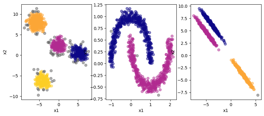
The grey colored points on the edges are categorized as noise by the algorithm. You can see that DBSCAN can deal with the non-linear data in the center plot. Plus, the algorithm itself determins the numeber of clusters. However, we need to specify the hyperparameters eps and min_samples in advance. Let’s see the impact this has:
cases = {"1": {"eps": 0.5, "min_samples": 5},
         "2": {"eps": 0.1, "min_samples": 5},
         "3": {"eps": 1, "min_samples": 5},
         "4": {"eps": 0.05, "min_samples": 10},
        }

labels_X = dict()
labels_W = dict()
labels_P = dict()

for case in cases.keys():
    dbscan = DBSCAN(eps=cases[case]["eps"], min_samples=cases[case]["min_samples"]).fit(X)
    labels_X[case] = dbscan.labels_

    dbscan = DBSCAN(eps=cases[case]["eps"], min_samples=cases[case]["min_samples"]).fit(W)
    labels_W[case] = dbscan.labels_

    dbscan = DBSCAN(eps=cases[case]["eps"], min_samples=cases[case]["min_samples"]).fit(P)
    labels_P[case] = dbscan.labels_


f = plt.figure()

for i in [1,2,3,4]:
    f.add_subplot(4, 3, i*3-2)

    plt.scatter(x1, x2, c = get_colors(labels_X[str(i)]), alpha=0.5)
    plt.xlabel("x1")
    plt.ylabel("x2")

    f.add_subplot(4, 3, i*3-1)

    plt.scatter(w1, w2, c = get_colors(labels_W[str(i)]), alpha=0.5)
    plt.xlabel("x1")
    plt.ylabel("x2")

    plt.title(cases[str(i)])

    f.add_subplot(4, 3, i*3)

    plt.scatter(p1, p2, c = get_colors(labels_P[str(i)]), alpha=0.5)
    plt.xlabel("x1")
    plt.ylabel("x2")


plt.subplots_adjust(wspace=0.2, hspace=0.8)
f.set_size_inches([10,8])
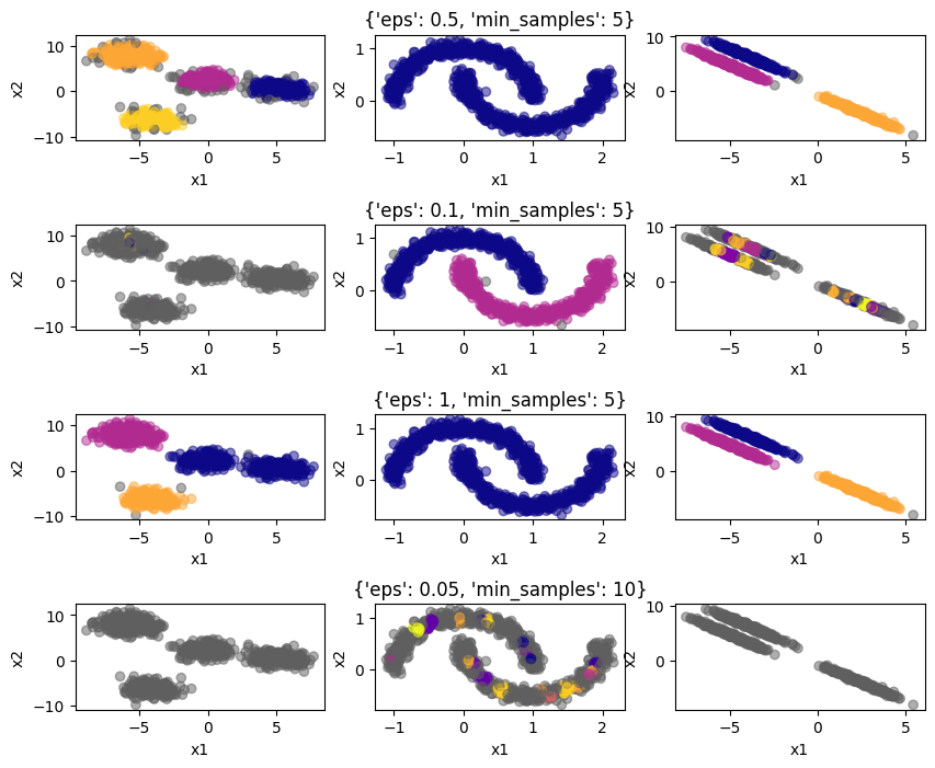
Clearly, the neighborhood size and minimum number of neighbors have to be selected carefully, otherwise the algorithm will not perform adequately. This is a disadvantage of DBSCAN.
Gaussian mixture model#
Now, let’s try clustering using a GMM.
from sklearn.mixture import GaussianMixture

gm = GaussianMixture(n_components=4, random_state=1).fit(X)
X_labels = gm.predict(X)
X_clusters = gm.means_

gm = GaussianMixture(n_components=2, random_state=1).fit(W)
W_labels = gm.predict(W)
W_clusters = gm.means_

gm = GaussianMixture(n_components=3, random_state=1).fit(P)
P_labels = gm.predict(P)
P_clusters = gm.means_

f, (ax1, ax2, ax3) = plt.subplots(1,3)

ax1.scatter(x1, x2, c = get_colors(X_labels), alpha=0.5)
ax1.scatter(X_clusters[:,0], X_clusters[:,1], color="k", marker="^")
ax1.set_xlabel("x1")
ax1.set_ylabel("x2")

ax2.scatter(w1, w2, c = get_colors(W_labels), alpha=0.5)
ax2.scatter(W_clusters[:,0], W_clusters[:,1], color="k", marker="^")
ax2.set_xlabel("x1")
ax2.set_ylabel("x2")

ax3.scatter(p1, p2, c = get_colors(P_labels), alpha=0.5)
ax3.scatter(P_clusters[:,0], P_clusters[:,1], color="k", marker="^")
ax3.set_xlabel("x1")
ax3.set_ylabel("x2")

f.set_size_inches([10,4])
The GMM does fine with the circular and elliptical data sets. But the number of clusters has to be specified in advance. GMM assumes that the underlying distributions are Gaussian, so it will perform well on data which is inherently Gaussian distributed. K-means clustering is a specific case of GMM.
Clustering of time series data for energy systems models#
Energy system models are key tools in designing the energy systems of the future. They optimize the design and operation of a power system, i.e., the set of technologies which produce, store, and transmit electricity. An energy systems model typically uses as inputs the technology CAPEXs, fuel prices (coal, natural gas, biomass, hydrogen), power demand, and capacity factors of renewable energy. The latter are time-dependent, they vary throughout the day and the year. Typically, the model is run for a set of days with historical or projected future data to simulate the requirements of the system. However, using a whole year of data (8760 h) is often impractical, as the computational time rises. Therefore, it can be preferential to select representative days from the entire year which capture the variation in the data set. Here, we use k-means clustering to determine these represenative days (similar to [HRS+17]).
Obtaining and cleaning the data#
The capacity factors for solar and wind and the power demand data were retrieved from the Open Power System Data (OPSD) database [Dat20].
Let’s have a look what the data looks like:
import pandas as pd

if 'google.colab' in str(get_ipython()):
  raw_data = pd.read_excel("https://raw.githubusercontent.com/edgarsmdn/MLCE_book/main/references/Power_system_data_DE.xlsx")
else:
  raw_data = pd.read_excel("references/Power_system_data_DE.xlsx")

raw_data.head(20)
| Unnamed: 0 | Unnamed: 1 | DE | DE.1 | DE.2 | DE.3 | DE.4 | |
|---|---|---|---|---|---|---|---|
| 0 | NaN | NaN | load | wind | wind_offshore | wind_onshore | solar |
| 1 | NaN | NaN | actual_entsoe_transparency | profile | profile | profile | profile |
| 2 | NaN | NaN | ENTSO-E Transparency | own calculation based on ENTSO-E Transparency ... | own calculation based on ENTSO-E Transparency ... | own calculation based on ENTSO-E Transparency ... | own calculation based on ENTSO-E Transparency ... |
| 3 | NaN | NaN | https://transparency.entsoe.eu/load-domain/r2/... | NaN | NaN | NaN | NaN |
| 4 | NaN | NaN | MW | fraction | fraction | fraction | fraction |
| 5 | utc_timestamp | cet_cest_timestamp | NaN | NaN | NaN | NaN | NaN |
| 6 | 2014-12-31 23:00:00 | 2015-01-01 00:00:00 | NaN | NaN | NaN | NaN | NaN |
| 7 | 2014-12-31 23:15:00 | 2015-01-01 00:15:00 | NaN | NaN | NaN | NaN | NaN |
| 8 | 2014-12-31 23:30:00 | 2015-01-01 00:30:00 | NaN | NaN | NaN | NaN | NaN |
| 9 | 2014-12-31 23:45:00 | 2015-01-01 00:45:00 | NaN | NaN | NaN | NaN | NaN |
| 10 | 2015-01-01 00:00:00 | 2015-01-01 01:00:00 | NaN | NaN | NaN | NaN | NaN |
| 11 | 2015-01-01 00:15:00 | 2015-01-01 01:15:00 | 41517.72 | 0.3159 | 0.7754 | 0.3047 | NaN |
| 12 | 2015-01-01 00:30:00 | 2015-01-01 01:30:00 | 41179.17 | 0.3158 | 0.7746 | 0.3045 | NaN |
| 13 | 2015-01-01 00:45:00 | 2015-01-01 01:45:00 | 40756.4 | 0.3197 | 0.7732 | 0.3086 | NaN |
| 14 | 2015-01-01 01:00:00 | 2015-01-01 02:00:00 | 40617.76 | 0.3244 | 0.7739 | 0.3134 | NaN |
| 15 | 2015-01-01 01:15:00 | 2015-01-01 02:15:00 | 40312.25 | 0.3243 | 0.7743 | 0.3132 | NaN |
| 16 | 2015-01-01 01:30:00 | 2015-01-01 02:30:00 | 39984.39 | 0.3235 | 0.7697 | 0.3125 | NaN |
| 17 | 2015-01-01 01:45:00 | 2015-01-01 02:45:00 | 39626.17 | 0.3254 | 0.7662 | 0.3146 | NaN |
| 18 | 2015-01-01 02:00:00 | 2015-01-01 03:00:00 | 39472.35 | 0.3264 | 0.7702 | 0.3156 | NaN |
| 19 | 2015-01-01 02:15:00 | 2015-01-01 03:15:00 | 39217.12 | 0.3232 | 0.7786 | 0.312 | NaN |
The data comprises the time series of the power demand in the German grid, called the load, and the capacity factors for wind and solar energy. The capacity factors are the ratio of power produced to power capacity installed, i.e., the fraction of the wind turbines and solar PV panels which produce power at any given point in time. They are a way to estimate how much renewable power is available to the system. Based on the timestamp, you can see that the data is reported in 15 min intervals for multiple years.
Now we bring the data into a format that is easier to manipulate and extract the data for the year 2018:
from datetime import datetime

raw_data.columns = ["utc_timestamp", "cet_timestamp", "demand", "wind", "offshore", "onshore", "solar"]
data = raw_data.drop(index=[0,1,2,3,4,5]).fillna(0)
for i, row in data.iterrows():
    data.at[i,"year"] = row["utc_timestamp"].year
    data.at[i,"month"] = row["utc_timestamp"].month
    data.at[i,"day"] = row["utc_timestamp"].day
    data.at[i,"date"] = row["utc_timestamp"].date()
    data.at[i,"time"] = row["utc_timestamp"].time()

data.head()
| utc_timestamp | cet_timestamp | demand | wind | offshore | onshore | solar | year | month | day | date | time | |
|---|---|---|---|---|---|---|---|---|---|---|---|---|
| 6 | 2014-12-31 23:00:00 | 2015-01-01 00:00:00 | 0.0 | 0.0 | 0.0 | 0.0 | 0.0 | 2014.0 | 12.0 | 31.0 | 2014-12-31 | 23:00:00 |
| 7 | 2014-12-31 23:15:00 | 2015-01-01 00:15:00 | 0.0 | 0.0 | 0.0 | 0.0 | 0.0 | 2014.0 | 12.0 | 31.0 | 2014-12-31 | 23:15:00 |
| 8 | 2014-12-31 23:30:00 | 2015-01-01 00:30:00 | 0.0 | 0.0 | 0.0 | 0.0 | 0.0 | 2014.0 | 12.0 | 31.0 | 2014-12-31 | 23:30:00 |
| 9 | 2014-12-31 23:45:00 | 2015-01-01 00:45:00 | 0.0 | 0.0 | 0.0 | 0.0 | 0.0 | 2014.0 | 12.0 | 31.0 | 2014-12-31 | 23:45:00 |
| 10 | 2015-01-01 00:00:00 | 2015-01-01 01:00:00 | 0.0 | 0.0 | 0.0 | 0.0 | 0.0 | 2015.0 | 1.0 | 1.0 | 2015-01-01 | 00:00:00 |
data_2018 = data.loc[data["year"]==2018]
data_2018
| utc_timestamp | cet_timestamp | demand | wind | offshore | onshore | solar | year | month | day | date | time | |
|---|---|---|---|---|---|---|---|---|---|---|---|---|
| 105226 | 2018-01-01 00:00:00 | 2018-01-01 01:00:00 | 41107.50 | 0.7591 | 0.8313 | 0.7528 | 0.0 | 2018.0 | 1.0 | 1.0 | 2018-01-01 | 00:00:00 |
| 105227 | 2018-01-01 00:15:00 | 2018-01-01 01:15:00 | 40690.50 | 0.7657 | 0.8635 | 0.7571 | 0.0 | 2018.0 | 1.0 | 1.0 | 2018-01-01 | 00:15:00 |
| 105228 | 2018-01-01 00:30:00 | 2018-01-01 01:30:00 | 40215.44 | 0.7778 | 0.8710 | 0.7695 | 0.0 | 2018.0 | 1.0 | 1.0 | 2018-01-01 | 00:30:00 |
| 105229 | 2018-01-01 00:45:00 | 2018-01-01 01:45:00 | 40436.86 | 0.7868 | 0.8789 | 0.7786 | 0.0 | 2018.0 | 1.0 | 1.0 | 2018-01-01 | 00:45:00 |
| 105230 | 2018-01-01 01:00:00 | 2018-01-01 02:00:00 | 40553.70 | 0.7905 | 0.8874 | 0.7819 | 0.0 | 2018.0 | 1.0 | 1.0 | 2018-01-01 | 01:00:00 |
| ... | ... | ... | ... | ... | ... | ... | ... | ... | ... | ... | ... | ... |
| 140261 | 2018-12-31 22:45:00 | 2018-12-31 23:45:00 | 44899.69 | 0.4469 | 0.6210 | 0.4269 | 0.0 | 2018.0 | 12.0 | 31.0 | 2018-12-31 | 22:45:00 |
| 140262 | 2018-12-31 23:00:00 | 2019-01-01 00:00:00 | 43168.15 | 0.4529 | 0.6293 | 0.4327 | 0.0 | 2018.0 | 12.0 | 31.0 | 2018-12-31 | 23:00:00 |
| 140263 | 2018-12-31 23:15:00 | 2019-01-01 00:15:00 | 43151.57 | 0.4681 | 0.6289 | 0.4496 | 0.0 | 2018.0 | 12.0 | 31.0 | 2018-12-31 | 23:15:00 |
| 140264 | 2018-12-31 23:30:00 | 2019-01-01 00:30:00 | 42827.22 | 0.4828 | 0.6274 | 0.4661 | 0.0 | 2018.0 | 12.0 | 31.0 | 2018-12-31 | 23:30:00 |
| 140265 | 2018-12-31 23:45:00 | 2019-01-01 00:45:00 | 42758.72 | 0.4855 | 0.5982 | 0.4725 | 0.0 | 2018.0 | 12.0 | 31.0 | 2018-12-31 | 23:45:00 |
35040 rows × 12 columns
Let’s plot the data!
data_2018_pivot = data_2018.pivot(index=["date"], columns=["time"], values=["wind","solar","demand"])
data_2018_pivot
| wind | ... | demand | |||||||||||||||||||
|---|---|---|---|---|---|---|---|---|---|---|---|---|---|---|---|---|---|---|---|---|---|
| time | 00:00:00 | 00:15:00 | 00:30:00 | 00:45:00 | 01:00:00 | 01:15:00 | 01:30:00 | 01:45:00 | 02:00:00 | 02:15:00 | ... | 21:30:00 | 21:45:00 | 22:00:00 | 22:15:00 | 22:30:00 | 22:45:00 | 23:00:00 | 23:15:00 | 23:30:00 | 23:45:00 |
| date | |||||||||||||||||||||
| 2018-01-01 | 0.7591 | 0.7657 | 0.7778 | 0.7868 | 0.7905 | 0.7944 | 0.7878 | 0.7879 | 0.8048 | 0.8140 | ... | 46478.69 | 45942.63 | 44647.53 | 43989.39 | 43253.15 | 42349.21 | 41847.29 | 41035.76 | 40468.81 | 39888.47 |
| 2018-01-02 | 0.3944 | 0.3949 | 0.3934 | 0.3893 | 0.3860 | 0.3789 | 0.3787 | 0.3764 | 0.3746 | 0.3820 | ... | 55288.77 | 54139.13 | 52994.37 | 52260.96 | 51553.50 | 50760.99 | 49669.29 | 48879.58 | 48385.56 | 48135.47 |
| 2018-01-03 | 0.7540 | 0.7664 | 0.7765 | 0.7828 | 0.7964 | 0.8093 | 0.8139 | 0.8196 | 0.8401 | 0.8575 | ... | 58552.29 | 57078.40 | 56366.52 | 54982.17 | 53792.97 | 53022.56 | 51850.51 | 50745.77 | 50515.68 | 50007.18 |
| 2018-01-04 | 0.9271 | 0.9225 | 0.9151 | 0.9047 | 0.8946 | 0.8888 | 0.8858 | 0.8891 | 0.8750 | 0.8649 | ... | 58703.71 | 57711.98 | 56356.32 | 54915.72 | 53810.35 | 52766.41 | 51180.27 | 50716.50 | 50414.69 | 49777.30 |
| 2018-01-05 | 0.8325 | 0.8460 | 0.8562 | 0.8583 | 0.8642 | 0.8757 | 0.8787 | 0.8756 | 0.8785 | 0.8688 | ... | 54919.61 | 53992.10 | 53354.64 | 52324.00 | 51190.13 | 50188.70 | 49513.35 | 48611.48 | 47778.13 | 47068.07 |
| ... | ... | ... | ... | ... | ... | ... | ... | ... | ... | ... | ... | ... | ... | ... | ... | ... | ... | ... | ... | ... | ... |
| 2018-12-27 | 0.2880 | 0.2895 | 0.2893 | 0.2851 | 0.2810 | 0.2832 | 0.2829 | 0.2811 | 0.2801 | 0.2830 | ... | 51086.44 | 50447.16 | 49853.24 | 48937.93 | 48349.58 | 47566.12 | 46844.44 | 46551.30 | 45754.90 | 45444.12 |
| 2018-12-28 | 0.2167 | 0.2153 | 0.2140 | 0.2104 | 0.2054 | 0.1987 | 0.1929 | 0.1893 | 0.1884 | 0.1903 | ... | 51858.28 | 51319.59 | 50177.74 | 49299.75 | 48571.00 | 48252.61 | 47561.57 | 46780.70 | 46148.57 | 45683.72 |
| 2018-12-29 | 0.2318 | 0.2360 | 0.2410 | 0.2493 | 0.2506 | 0.2501 | 0.2478 | 0.2458 | 0.2443 | 0.2473 | ... | 50810.94 | 49663.63 | 48975.79 | 48488.65 | 47807.15 | 46856.65 | 45599.00 | 44935.01 | 44482.17 | 44129.05 |
| 2018-12-30 | 0.6881 | 0.6883 | 0.6911 | 0.6895 | 0.6868 | 0.6842 | 0.6794 | 0.6795 | 0.6768 | 0.6784 | ... | 47754.48 | 47219.02 | 46749.31 | 45982.74 | 45051.08 | 44264.46 | 43705.56 | 43265.03 | 42591.12 | 42039.58 |
| 2018-12-31 | 0.1727 | 0.1682 | 0.1631 | 0.1577 | 0.1526 | 0.1487 | 0.1477 | 0.1475 | 0.1429 | 0.1371 | ... | 47266.06 | 46876.10 | 46212.79 | 45931.44 | 45502.07 | 44899.69 | 43168.15 | 43151.57 | 42827.22 | 42758.72 |
365 rows × 288 columns
f, (ax1, ax2, ax3) = plt.subplots(1,3)

for i, row in data_2018_pivot.iterrows():
    ax1.plot(row["wind"].values, lw=0.2, alpha=0.5, color=plt.get_cmap("Blues")(np.random.rand(1)))
    ax2.plot(row["solar"].values, lw=0.2, alpha=0.5, color=plt.get_cmap("YlOrBr")(np.random.rand(1)*0.5))
    ax3.plot(row["demand"].values, lw=0.2, alpha=0.5, color=plt.get_cmap("Greys")(np.random.rand(1)))

ax1.set_xticks([0, 23, 47, 71, 95], labels=["0:00", "6:00", "12:00", "18:00", "24:00"])
ax2.set_xticks([0, 23, 47, 71, 95], labels=["0:00", "6:00", "12:00", "18:00", "24:00"])
ax3.set_xticks([0, 23, 47, 71, 95], labels=["0:00", "6:00", "12:00", "18:00", "24:00"])

ax1.set_ylim([0,1])
ax2.set_ylim([0,1])

ax1.set_xlim([0,95])
ax2.set_xlim([0,95])
ax3.set_xlim([0,95])

ax1.set_ylabel("wind capacity factor")
ax2.set_ylabel("solar capacity factor")
ax3.set_ylabel("power demand / MW")

plt.subplots_adjust(wspace=0.4)

f.set_size_inches([10,4])
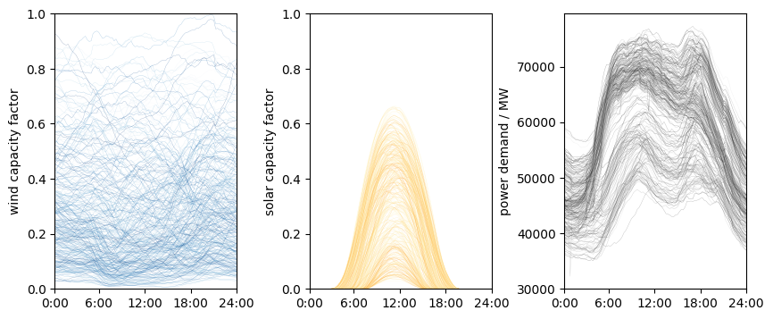
Clearly, there is significant variation in the data. Further, the solar and demand profiles have their characteristic shapes. The variation needs to be represented in energy systems models. But how do we choose which days to use as representatives? Here, we use clustering to determine the representatives.
Clustering on time series data#
wind_data = data_2018[["date", "utc_timestamp","wind"]].melt(id_vars="date", value_vars="wind").drop("variable", axis=1)
solar_data = data_2018[["date", "utc_timestamp","solar"]].melt(id_vars="date", value_vars="solar").drop("variable", axis=1)
demand_data = data_2018[["date", "utc_timestamp","demand"]].melt(id_vars="date", value_vars="demand").drop("variable", axis=1)

solar_data
| date | value | |
|---|---|---|
| 0 | 2018-01-01 | 0.0 |
| 1 | 2018-01-01 | 0.0 |
| 2 | 2018-01-01 | 0.0 |
| 3 | 2018-01-01 | 0.0 |
| 4 | 2018-01-01 | 0.0 |
| ... | ... | ... |
| 35035 | 2018-12-31 | 0.0 |
| 35036 | 2018-12-31 | 0.0 |
| 35037 | 2018-12-31 | 0.0 |
| 35038 | 2018-12-31 | 0.0 |
| 35039 | 2018-12-31 | 0.0 |
35040 rows × 2 columns
Now we scale the data. Then, for each day we concatenate the three profiles together to one vector:
from sklearn.preprocessing import StandardScaler

wind_scaler = StandardScaler()
wind_scaled = pd.DataFrame(columns=["date","value"])
wind_scaled["date"] = wind_data["date"]
wind_scaled["value"] = wind_scaler.fit_transform(np.array(wind_data["value"]).reshape(-1, 1))

solar_scaler = StandardScaler()
solar_scaled = pd.DataFrame(columns=["date","value"])
solar_scaled["date"] = solar_data["date"]
solar_scaled["value"] = solar_scaler.fit_transform(np.array(solar_data["value"]).reshape(-1, 1))

demand_scaler = StandardScaler()
demand_scaled = pd.DataFrame(columns=["date","value"])
demand_scaled["date"] = demand_data["date"]
demand_scaled["value"] = demand_scaler.fit_transform(np.array(demand_data["value"]).reshape(-1, 1))

input_data = pd.DataFrame()

for day in wind_data["date"].drop_duplicates():
    wind = wind_scaled.loc[wind_scaled["date"]==day]["value"].values
    solar = solar_scaled.loc[solar_scaled["date"]==day]["value"].values
    demand = demand_scaled.loc[demand_scaled["date"]==day]["value"].values

    day_series = np.concatenate([wind, solar, demand])

    input_data[day] = day_series

input_data
| 2018-01-01 | 2018-01-02 | 2018-01-03 | 2018-01-04 | 2018-01-05 | 2018-01-06 | 2018-01-07 | 2018-01-08 | 2018-01-09 | 2018-01-10 | ... | 2018-12-22 | 2018-12-23 | 2018-12-24 | 2018-12-25 | 2018-12-26 | 2018-12-27 | 2018-12-28 | 2018-12-29 | 2018-12-30 | 2018-12-31 | |
|---|---|---|---|---|---|---|---|---|---|---|---|---|---|---|---|---|---|---|---|---|---|
| 0 | 2.460270 | 0.623795 | 2.434588 | 3.306246 | 2.829881 | 0.218935 | 0.306050 | 0.697315 | 2.146050 | -0.136577 | ... | 2.501058 | 0.691776 | 0.274830 | 0.636888 | 1.140949 | 0.088010 | -0.271026 | -0.194989 | 2.102744 | -0.492592 |
| 1 | 2.493504 | 0.626313 | 2.497029 | 3.283083 | 2.897861 | 0.221453 | 0.335257 | 0.710407 | 2.127922 | -0.141612 | ... | 2.491490 | 0.686236 | 0.339789 | 0.633363 | 1.139438 | 0.095563 | -0.278076 | -0.173840 | 2.103751 | -0.515252 |
| 2 | 2.554435 | 0.618760 | 2.547889 | 3.245819 | 2.949224 | 0.225985 | 0.358420 | 0.712421 | 2.122886 | -0.170315 | ... | 2.431567 | 0.618256 | 0.332235 | 0.646455 | 1.144977 | 0.094556 | -0.284623 | -0.148662 | 2.117851 | -0.540933 |
| 3 | 2.599755 | 0.598114 | 2.579613 | 3.193449 | 2.959799 | 0.190232 | 0.405251 | 0.733067 | 2.122383 | -0.184415 | ... | 2.357544 | 0.574447 | 0.325689 | 0.661562 | 1.138935 | 0.073407 | -0.302751 | -0.106867 | 2.109794 | -0.568125 |
| 4 | 2.618387 | 0.581496 | 2.648097 | 3.142590 | 2.989509 | 0.203325 | 0.439493 | 0.749685 | 2.141014 | -0.191968 | ... | 2.272946 | 0.564879 | 0.337775 | 0.660051 | 1.123828 | 0.052761 | -0.327928 | -0.100320 | 2.096198 | -0.593807 |
| ... | ... | ... | ... | ... | ... | ... | ... | ... | ... | ... | ... | ... | ... | ... | ... | ... | ... | ... | ... | ... | ... |
| 283 | -1.475803 | -0.625654 | -0.397085 | -0.422973 | -0.683493 | -1.121168 | -0.848942 | -0.265237 | -0.258524 | -0.357837 | ... | -1.148783 | -1.411650 | -1.322191 | -1.322631 | -1.187623 | -0.948548 | -0.879167 | -1.020252 | -1.282236 | -1.218035 |
| 284 | -1.526531 | -0.735988 | -0.515540 | -0.583279 | -0.751749 | -1.216521 | -0.938565 | -0.348816 | -0.341451 | -0.469038 | ... | -1.242857 | -1.516934 | -1.408817 | -1.348442 | -1.202761 | -1.021486 | -0.949008 | -1.147358 | -1.338722 | -1.393036 |
| 285 | -1.608549 | -0.815802 | -0.627192 | -0.630151 | -0.842898 | -1.316239 | -0.989404 | -0.434623 | -0.429332 | -0.539963 | ... | -1.328017 | -1.597543 | -1.452584 | -1.380525 | -1.243085 | -1.051113 | -1.027928 | -1.214466 | -1.383245 | -1.394712 |
| 286 | -1.665849 | -0.865730 | -0.650447 | -0.660653 | -0.927121 | -1.382748 | -1.034007 | -0.494846 | -0.527067 | -0.600682 | ... | -1.379236 | -1.652659 | -1.478876 | -1.426316 | -1.306153 | -1.131602 | -1.091815 | -1.260232 | -1.451354 | -1.427492 |
| 287 | -1.724502 | -0.891006 | -0.701839 | -0.725072 | -0.998885 | -1.429415 | -1.058536 | -0.518866 | -0.572704 | -0.671999 | ... | -1.439154 | -1.702917 | -1.527665 | -1.469805 | -1.352079 | -1.163012 | -1.138796 | -1.295921 | -1.507097 | -1.434416 |
288 rows × 365 columns
input_array = np.array(input_data).T
input_array.shape
(365, 288)
Now we perform the actual clustering on the complete wind-solar-demand profiles:
kmeans = KMeans(n_clusters=10, random_state=0, n_init=10).fit(input_array)
profiles_labels = kmeans.labels_
profiles_clusters = kmeans.cluster_centers_
Let’s see what the clusters and the centroids look like:
clusters_plot = [3,6,9]

f, ((ax1, ax2, ax3),(ax4, ax5, ax6),(ax7, ax8, ax9)) = plt.subplots(3,3)

for i in range(0,364):
    if profiles_labels[i] == clusters_plot[0]:
        ax1.plot(data_2018_pivot.iloc[i]["wind"].values, lw=0.5, alpha=0.5, color=plt.get_cmap("Blues")(np.random.rand(1)))
        ax1.plot(wind_scaler.inverse_transform(profiles_clusters[clusters_plot[0]][0:96].reshape(-1, 1)), lw=1, alpha=1, color=plt.get_cmap("Blues")(0.9))
        ax2.plot(data_2018_pivot.iloc[i]["solar"].values, lw=0.5, alpha=0.5, color=plt.get_cmap("YlOrBr")(np.random.rand(1)*0.5))
        ax2.plot(solar_scaler.inverse_transform(profiles_clusters[clusters_plot[0]][96:192].reshape(-1, 1)), lw=1, alpha=1, color=plt.get_cmap("YlOrBr")(0.5))
        ax3.plot(data_2018_pivot.iloc[i]["demand"].values, lw=0.5, alpha=0.5, color=plt.get_cmap("Greys")(np.random.rand(1)))
        ax3.plot(demand_scaler.inverse_transform(profiles_clusters[clusters_plot[0]][192:288].reshape(-1, 1)), lw=1, alpha=1, color=plt.get_cmap("Greys")(0.9))
    if profiles_labels[i] == clusters_plot[1]:
        ax4.plot(data_2018_pivot.iloc[i]["wind"].values, lw=0.5, alpha=0.5, color=plt.get_cmap("Blues")(np.random.rand(1)))
        ax4.plot(wind_scaler.inverse_transform(profiles_clusters[clusters_plot[1]][0:96].reshape(-1, 1)), lw=1, alpha=1, color=plt.get_cmap("Blues")(0.9))
        ax5.plot(data_2018_pivot.iloc[i]["solar"].values, lw=0.5, alpha=0.5, color=plt.get_cmap("YlOrBr")(np.random.rand(1)*0.5))
        ax5.plot(solar_scaler.inverse_transform(profiles_clusters[clusters_plot[1]][96:192].reshape(-1, 1)), lw=1, alpha=1, color=plt.get_cmap("YlOrBr")(0.5))
        ax6.plot(data_2018_pivot.iloc[i]["demand"].values, lw=0.5, alpha=0.5, color=plt.get_cmap("Greys")(np.random.rand(1)))
        ax6.plot(demand_scaler.inverse_transform(profiles_clusters[clusters_plot[1]][192:288].reshape(-1, 1)), lw=1, alpha=1, color=plt.get_cmap("Greys")(0.9))
    if profiles_labels[i] == clusters_plot[2]:
        ax7.plot(data_2018_pivot.iloc[i]["wind"].values, lw=0.5, alpha=0.5, color=plt.get_cmap("Blues")(np.random.rand(1)))
        ax7.plot(wind_scaler.inverse_transform(profiles_clusters[clusters_plot[2]][0:96].reshape(-1, 1)), lw=1, alpha=1, color=plt.get_cmap("Blues")(0.9))
        ax8.plot(data_2018_pivot.iloc[i]["solar"].values, lw=0.5, alpha=0.5, color=plt.get_cmap("YlOrBr")(np.random.rand(1)*0.5))
        ax8.plot(solar_scaler.inverse_transform(profiles_clusters[clusters_plot[2]][96:192].reshape(-1, 1)), lw=1, alpha=1, color=plt.get_cmap("YlOrBr")(0.5))
        ax9.plot(data_2018_pivot.iloc[i]["demand"].values, lw=0.5, alpha=0.5, color=plt.get_cmap("Greys")(np.random.rand(1)))
        ax9.plot(demand_scaler.inverse_transform(profiles_clusters[clusters_plot[2]][192:288].reshape(-1, 1)), lw=1, alpha=1, color=plt.get_cmap("Greys")(0.9))

for ax in [ax1, ax2, ax3, ax4, ax5, ax6, ax7, ax8, ax9]:
    ax.set_xticks([0, 23, 47, 71, 95], labels=["0:00", "6:00", "12:00", "18:00", "24:00"])
    ax.set_xlim([0,95])

for ax in [ax1, ax2, ax4, ax5, ax7, ax8]:
    ax.set_ylim([0,1])

for ax in [ax3, ax6, ax9]:
    ax.set_ylim([data_2018_pivot["demand"].values.min(),data_2018_pivot["demand"].values.max()])

ax4.set_ylabel("wind capacity factor")
ax5.set_ylabel("solar capacity factor")
ax6.set_ylabel("power demand / MW")

ax2.set_title("cluster "+ str(clusters_plot[0]))
ax5.set_title("cluster "+ str(clusters_plot[1]))
ax8.set_title("cluster "+ str(clusters_plot[2]))

plt.subplots_adjust(wspace=0.4, hspace=0.3)

f.set_size_inches([10,10])
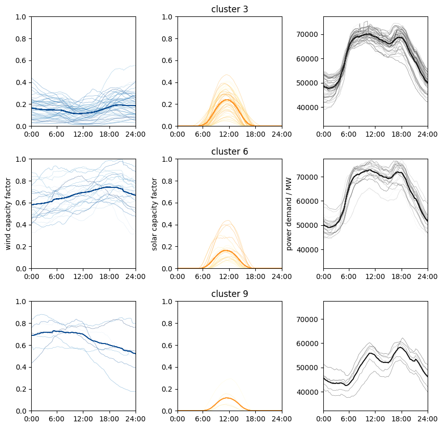
It seems like the clustering is doing a good job grouping similar data together!
How good is the clustering performance as a function of the number of clusters and centroids? We determine this with an elbow plot:
num_k = range(1,30)
errors = []

for k in num_k:
    kmeans = KMeans(n_clusters=k, random_state=0, n_init=10).fit(input_array)
    errors.append(kmeans.inertia_)
f, (ax) = plt.subplots(1,1)
ax.plot(num_k, errors, lw=0.2, marker= "x", ms= 10, color=get_colors([1])[0] )
ax.set_xlabel("number of clusters k")
ax.set_ylabel("total distance")
Text(0, 0.5, 'total distance')
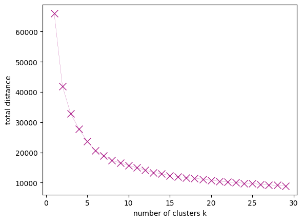
Now the modeler can use the representative days in the energy systems model and evaluate the model performance and computational time vs. the number of clusters. Then the number of clusters which delivers a compromise between accuracy and computational burden can be selected.
Exercise ❗❗#
Take a closer look at the wind and demand centroids. Note that the profiles of the centroids are inherently smooth, less fluctuating than the individual profiles. This can constitute a problem for the energy system model, since it underestimates the variation of the wind energy or demand. Therefore, instead of using the centroids in the model, one can use the actual profile in the cluster which is closest to the centroid. Select these representative profiles from the clusters and plot them compared to the centroids.
# Your code here
Assume we want to determine representative days for the onshore wind and offshore wind capacity factors. Perform the data manipulation needed, then use a Gaussian mixture model to determine the clusters.
# Your code here
The point about the smoothness of the profiles illustrates that one always needs to keep in mind the purpose and context of the data set and the model. Always consider your knowledge about the application and the domain, and utilize them to improve your machine learning models.
References#
- Dat20
Open Power System Data. Data package time series. version 2020-10-06. 2020. https://doi.org/10.25832/time_series/2020-10-06 (primary data from various sources, for a complete list see URL).
- HRS+17(1,2)
Clara F Heuberger, Edward S Rubin, Iain Staffell, Nilay Shah, and Niall Mac Dowell. Power capacity expansion planning considering endogenous technology cost learning. Applied Energy, 204:831–845, 2017.
- KFC22
Ankur Kumar and Jesus Flores-Cerrillo. Machine Learning in Python for Process Systems Engineering. MLforPSE, 2022. https://mlforpse.com/books/.